In simple terms User-Interface (UI) is the area in which the human-machine interaction occurs and UI designing is the wide field encompassing UI creation and optimization of UI. In the starting of computer age, creating UI was more of an instinctive process, in many ways it still is, but in this commercial era UI creation has taken a more analytics rich role. You need not only a good creative sense, but also a deeper understating of your user requirements. Without proper planning you would end up creating a product that is doomed to become an ignominious failure.
So I am going to discuss some examples of UI best practices and I would like the readers to also keep in mind all the UI components used by the application as they analyze the images. It may give you a different perspective about your own UI design.
Do’s and Don’ts of User Interface Design
Simplicity is the key
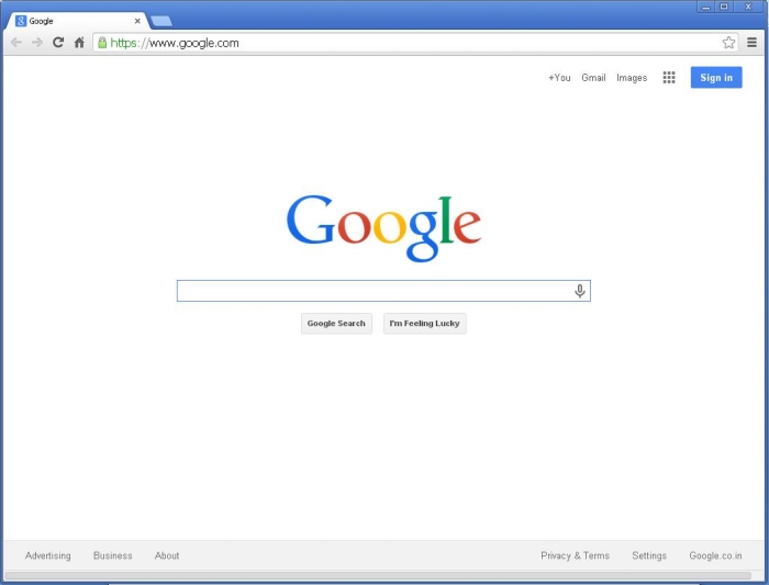
Most popular websites today are extremely simple. Minimalistic content and keeping the user-actions to a minimum are the trend today. Google.com is the prime example of this policy.
Unfortunately there are tons of website that can be considered a bad example in this category. Reddit is the prime example of bad UI.

It is a jungle, but to be honest the creators of this website most probably wanted to create a jungle.
Use common UI elements
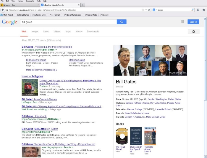
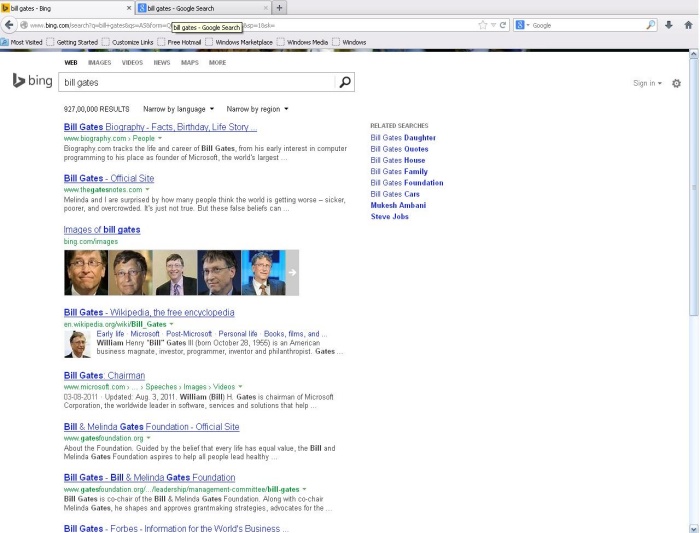
I searched the same thing on Google and Bing. The results were a little different but the UI and presentation is so similar that on first look it becomes difficult to differentiate between the two. However from a user perspective it’s good. Now I don’t have to familiarize myself with 2 different UI designs, I can easily use Bing or Google without any difficulty.
Totally different UI is the main reason why it becomes difficult for windows users to migrate to Mac computers and vice-versa.
The purpose should be evident
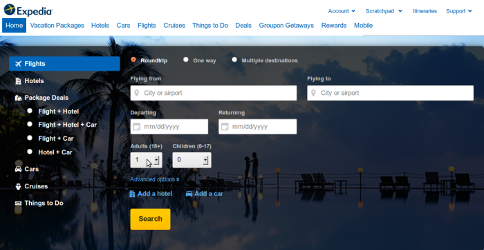
The main aim of the UI should be to make it evident what the purpose of the application is. These online plane-ticket booking websites are good examples. Their first fold itself highlight that you can book tickets on the website.

Remember Microsoft paint? That underestimated software that everyone knows how to use. In first look of the software screen you can identify that it can be used to create images.

Placement should facilitate information searching
Place you content in such a way that user can easily identify what application or website is all about. Highlight important buttons and subtly attract the attention of the user towards important text pieces.

Typography is highly important
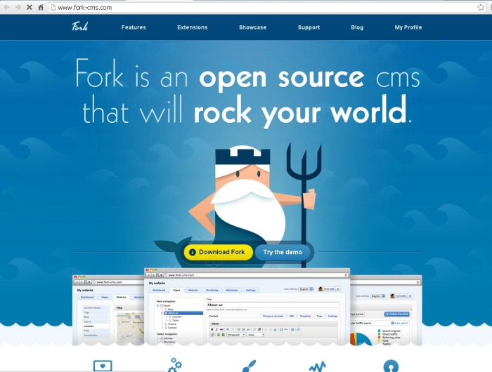
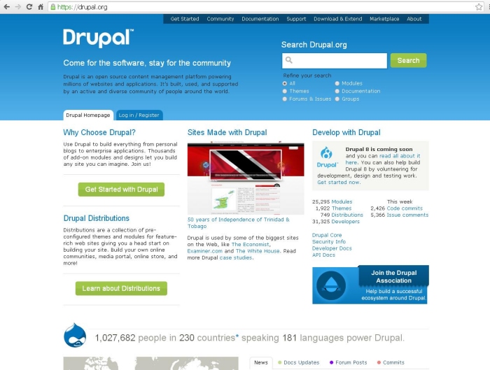
Typography is also very important in establishing credibility. It clearly highlights what important and what’s not, and instantly gathers people attention to important things. I showed a complete tech ignorant websites of Drupal and Fork CMS, and he instantly said that Fork one would be much popular than Drupal, even though it’s entirely opposite, big time. I am not saying that Dupal.org should change its website’s design. I only want to highlight that by simply using graphic elements and big bold texts, users can be impressed.
Application should communicate with user
You application should always communicate what’s happening. The user must never get the impression that the app is stuck or hung up. It’s very important in creating loading-bars in slow loading applications. Animated loading bars highlight that the app is working in the back ground, without testing the patience of the user.


Switch back to Defaults on important things
Innovation is a good thing. But sometimes using a totally new type of UI becomes more of an inconvenience than an asset. So it’s always wise to use simple old-school user interface fields. There is set standard for some types of UI like forward and back buttons, dropdown buttons, input fields etc, and if you disturb this trend users sometimes become confused. So it’s wise not to experiment much with the simple things, unless you are Google or apple or Microsoft.