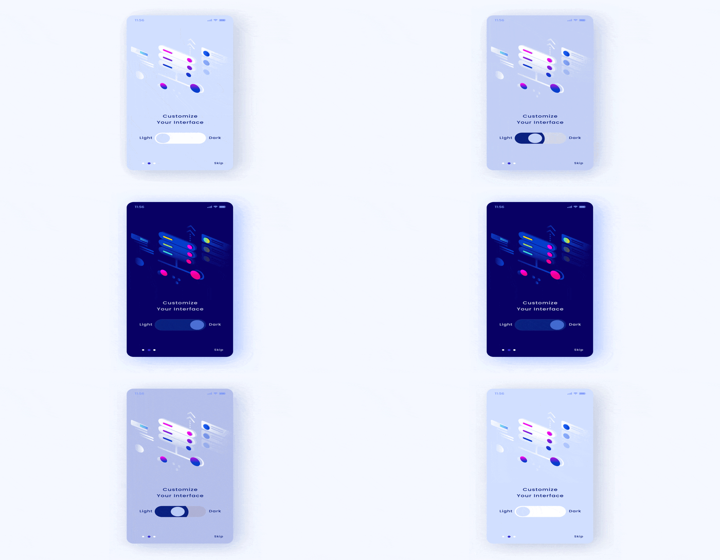
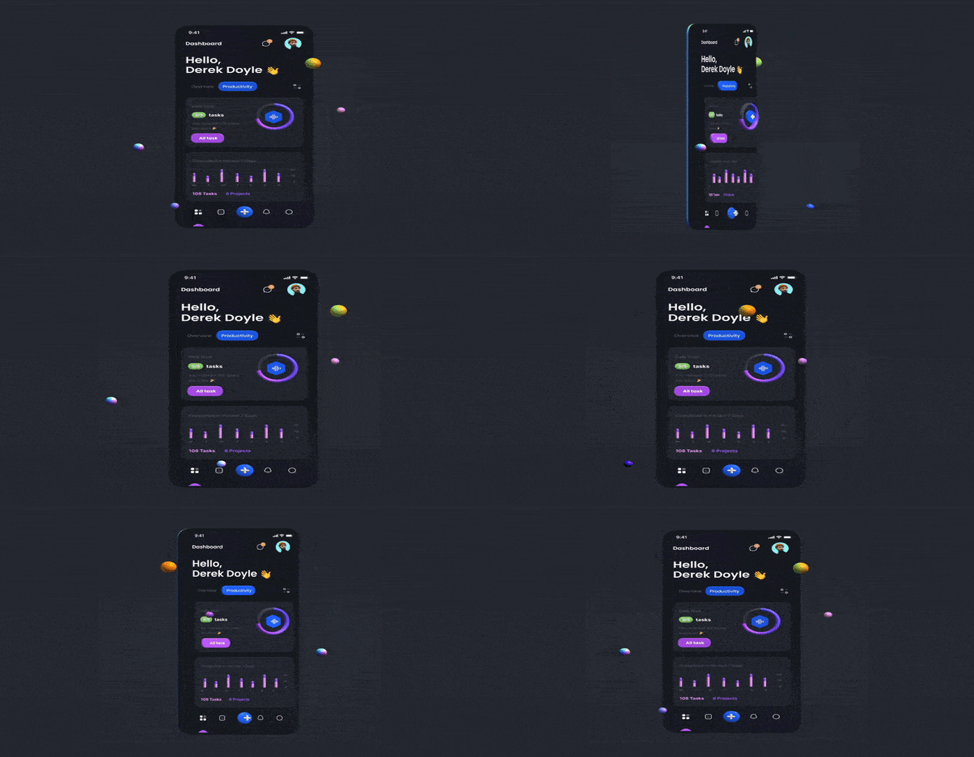
Most people spend endless amount of hours working before their laptop and phone. If there is one thing that is common among all these people, it is the usage of the dark mode. This mode has been drawing all the limelight, and for all the right reasons. Dark mode design for mobile apps is regarded as one of the necessary features by the audience since it provides the eyes with an indispensable amount of relief. The exigency of the mode is perceived and implemented in every app design like Whatsapp, Facebook, Google, and so on.
Relish continuous mobile app scrolling without having to worry about eye strain with the implementation of the dark mode
Why Opt for Dark Mode in your App?
While most of us are clinched about switching to this mode for most of our apps, not everyone is aware of certain benefits that it offers.
1. Dark Mode is Battery Saving: The majority of mobile app development either includes OLED or AMOLED displays. Unlike LCD screens, this dark mode design for your app works by deactivating the black pixels and conserves the phone’s energy, preventing its battery drainage.

2. Dark Mode is Alleviating to the Eyes: Too much brightness in any way is detrimental to the eyes, and a mobile app design offering darkness is always beneficial to the eyes. We often use the phone while in the dark for reading, writing, and additional work. Switching to this mode will provide gentleness to the eye as compared to brighter colors.
Apart from these two primary reasons, dark mode design for your app is gradually becoming a prerequisite in the market because of its rising demand.
Steps to Implement Dark Mode Design for Mobile Apps Effectively
Certain mandatory specifications need to be followed while creating dark-themed designs for mobile apps to ensure a healthy UI experience. Let us get going.
1. Avert Saturated Colors
While creating a dark appearance for your phone app, it is essential to play with only unsaturated colors. It holds that saturated colors do appear eye-catchy on light backgrounds, but on dark surfaces, it isn’t the most appealing. The amalgamation of dark color with saturated color offers a contrasting vibration to the eyes, and it makes it difficult for the eyes to read.

2. Say No To Absolute Darkness
One thing to remember during the creation of such mode for the app is to evade making the appearance completely black. The reason is, when there is a completely contrasting backdrop, understanding the text becomes even more difficult. Mobile app development services ensure that the dark grey shade is used instead of complete black. It not only lessens the contrast but also the related eye strain. Additionally, it also aids in the exposure to a myriad of color ranges, depths, and heights.
3. Say No To Absolute White
Just like the previous point, having a completely white background is also not recommended while creating a dark mode design for your app. A bright color leads to troubling reading, and that leads to opacity playing a major role while devising the dark mode app. It needs to be remembered that opacity needs to be not greater than 87%.
4. Color Inversion
It is not possible to create an iOS or android dark mode completely resembling the related light mode. Humans tend to perceive each color differently on distinct backgrounds. Therefore, it is not feasible to imply parallel emotions through similar colors. The approach to handle this is hunting for color alternatives and leveraging the fact that colors on a dark mode iOS or android appear way more striking.
5. Illustrations and Animations
Like color modifications, there are fewer chances of averting design adjustments of illustrations and animations during the creation of mobile application design incorporating darkness. Every trivial element of the application needs to not only abide by the fresh new color palette but also be visible.
6. Creating your Design’s Emotional Element
While designing dark theme for the app, it is essential to portray your particular emotions in a similar mode as well. Though you shouldn’t incorporate it because the shades are identified differently focused on their background. The dark theme in the mobile app UI design will not be able to communicate similarly to the light theme. This means both themes give out individual emotions.
Is it Proper to Develop Dark Mode Design for Mobile Apps?
There is no doubt that implementing darkness will be immensely beneficial for the app. This mode is acclaimed for boosting specific emotions among customers, especially wisdom, strength, luxury, and courage. This is a quite modern solution, and the majority of apps are experiencing it.
Your app will encounter a complete evolution with the incorporation of the dark theme. If you are interested in creating an app with built-in dark theme, Algoworks will guide you through the process. The company is renowned for having some eminent employees with extensive experience.
About Us: Algoworks is a B2B IT firm providing end-to-end product development services. Operating chiefly from its California office, Algoworks is reputed for its partnership with Fortune 500 companies such as Amazon, Dell, Salesforce, and Microsoft. Algoworks is an expert in UI/UX Designs with experience catering to enterprises belonging to all domains. This includes: Brand Strategy, Product Design, UX Research, UI & Animation and Design Testing. For more information, contact us here.


